


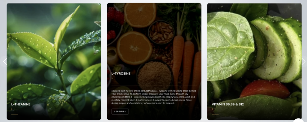
Carousel
{{ ‘https://unpkg.com/flickity@2/dist/flickity.min.css’ | stylesheet_tag }}
<script src=”https://unpkg.com/flickity@2/dist/flickity.pkgd.min.js” defer></script>
<section class=”ambassador-carousel-section”
style=”background-color: {{ section.settings.bg_color }};
{% if section.settings.bg_image != blank %}
background-image: url(‘{{ section.settings.bg_image | image_url: width: 2000 }}’);
background-size: cover;
background-position: center;
background-attachment: fixed;
{% endif %}”>
<div class=”section-overlay” style=”background: rgba(0,0,0, {{ section.settings.overlay_opacity }});”></div>
<div class=”ambassador-main-carousel”
data-flickity='{
“cellAlign”: “left”,
“contain”: true,
“wrapAround”: true,
“pageDots”: false,
“prevNextButtons”: true,
“arrowShape”: “M 15,50 L 65,100 L 70,95 L 25,50 L 70,5 L 65,0 Z”
}’>
{% for block in section.blocks %}
<div class=”carousel-cell”>
<a href=”{{ block.settings.link | default: ‘#’ }}” class=”ambassador-card”>
<div class=”image-container”>
{% if block.settings.image != blank %}
<img src=”{{ block.settings.image | image_url: width: 1000 }}” alt=”{{ block.settings.name }}”>
{% else %}
{{ ‘image’ | placeholder_svg_tag: ‘placeholder-svg’ }}
{% endif %}
<div class=”card-content”>
<div class=”text-content-wrapper”>
<div class=”main-headings”>
<h3 class=”ambassador-name”>{{ block.settings.name }}</h3>
<p class=”ambassador-title”>{{ block.settings.title }}</p>
</div>
<div class=”divider”></div>
<div class=”quote-reveal”>
{% if block.settings.quote != blank %}
<p class=”quote-text”>{{ block.settings.quote }}</p>
{% endif %}
{% if block.settings.badge != blank %}
<div class=”certification-badge”>{{ block.settings.badge }}</div>
{% endif %}
</div>
</div>
</div>
</div>
</a>
</div>
{% endfor %}
</div>
</section>
{% schema %}
{
“name”: “ingredient Carousel”,
“settings”: [
{
“type”: “image_picker”,
“id”: “bg_image”,
“label”: “Section Background Image”
},
{
“type”: “range”,
“id”: “overlay_opacity”,
“label”: “Background Darken Overlay”,
“min”: 0,
“max”: 1,
“step”: 0.1,
“default”: 0.5
},
{
“type”: “color”,
“id”: “bg_color”,
“label”: “Fallback Background Color”,
“default”: “#0a0a0a”
}
],
“blocks”: [
{
“type”: “ambassador”,
“name”: “ingredient”,
“settings”: [
{ “type”: “image_picker”, “id”: “image”, “label”: “Photo” },
{ “type”: “text”, “id”: “name”, “label”: “Name”, “default”: “Name” },
{ “type”: “text”, “id”: “title”, “label”: “Title”, “default”: “Title/Role” },
{ “type”: “textarea”, “id”: “quote”, “label”: “Quote on Hover” },
{ “type”: “text”, “id”: “badge”, “label”: “Badge Text”, “default”: “NSF CERTIFIED” },
{ “type”: “url”, “id”: “link”, “label”: “Card Link” }
]
}
],
“presets”: [{ “name”: “Ambassador Carousel” }]
}
{% endschema %}
<style>
.ambassador-carousel-section {
position: relative;
padding: 80px 0;
overflow: hidden;
background-repeat: no-repeat;
}
.section-overlay {
position: absolute;
top: 0;
left: 0;
width: 100%;
height: 100%;
z-index: 1;
}
/* Forces horizontal layout and sits above overlay */
.ambassador-main-carousel {
width: 100%;
display: block;
position: relative;
z-index: 2;
padding: 0 40px;
}
.carousel-cell {
width: 32%;
margin-right: 25px;
min-height: 450px;
}
.ambassador-card { position: relative; border-radius: 16px; overflow: hidden; background: #1a1a1a; text-decoration: none; display: block; }
.image-container { position: relative; aspect-ratio: 4 / 5; width: 100%; overflow: hidden; }
.image-container img { width: 100%; height: 100%; object-fit: cover; transition: transform 0.8s cubic-bezier(0.2, 1, 0.3, 1), filter 0.8s ease; }
.card-content {
position: absolute; bottom: 0; left: 0; width: 100%; padding: 30px;
background: linear-gradient(to top, rgba(0, 0, 0, 0.98) 0%, rgba(0,0,0,0.4) 60%, transparent 100%);
color: white; box-sizing: border-box; display: flex; flex-direction: column; justify-content: flex-end;
}
.text-content-wrapper { transition: transform 0.6s cubic-bezier(0.2, 1, 0.3, 1); transform: translateY(15px); }
.main-headings { transition: transform 0.6s cubic-bezier(0.2, 1, 0.3, 1); }
.ambassador-name { margin: 0; font-size: 1.5rem; font-weight: 700; text-transform: uppercase; color: white; }
.ambassador-title { margin: 5px 0 0 0; font-size: 0.9rem; color: #c5a059; font-weight: 500; }
.divider { width: 40px; height: 1px; background: #c5a059; margin: 15px 0; transition: width 0.6s ease; }
.quote-reveal { max-height: 0; opacity: 0; overflow: hidden; transition: max-height 0.6s ease, opacity 0.4s ease; }
.quote-text { font-size: 1rem; line-height: 1.4; font-style: italic; color: #eee; margin: 0 0 15px 0; }
.certification-badge { display: inline-block; padding: 4px 10px; border: 1px solid rgba(255, 255, 255, 0.3); border-radius: 4px; font-size: 9px; font-weight: 600; text-transform: uppercase; }
/* — Hover Logic — */
.ambassador-card:hover img { transform: scale(1.08); filter: brightness(0.4); }
.ambassador-card:hover .text-content-wrapper { transform: translateY(0); }
.ambassador-card:hover .main-headings { transform: translateY(-10px); }
.ambassador-card:hover .divider { width: 100%; }
.ambassador-card:hover .quote-reveal { max-height: 400px; opacity: 1; }
/* — Nav Icon Stability Fixes — */
.ambassador-main-carousel .flickity-prev-next-button {
top: 50% !important;
transform: translateY(-50%) !important;
transition: background 0.3s ease, transform 0.3s ease !important;
z-index: 10 !important;
background: rgba(255,255,255,0.1);
color: #fff;
width: 50px;
height: 50px;
border-radius: 50%;
}
.ambassador-main-carousel .flickity-prev-next-button:hover {
transform: translateY(-50%) scale(1.1) !important;
background: #c5a059 !important;
}
.ambassador-main-carousel .flickity-prev-next-button.previous { left: 10px; }
.ambassador-main-carousel .flickity-prev-next-button.next { right: 10px; }
@media (max-width: 1024px) { .carousel-cell { width: 48%; } }
@media (max-width: 768px) {
.carousel-cell { width: 85%; }
.ambassador-carousel-section { background-attachment: scroll; } /* Better performance for mobile */
}
</style>